Printing press is a device which applying pressure to an inked surface such as a cloth, it was used back in the day to print products such as newspapers and books. it was invented in the 1440 and was invented by Johsnnes Gutenberg.the printing press allows you to share large amount of information quickly in huge numbers.there was many advantages and disadvantages. Gutenberg's printing process was seen to be slow and tedious; compositors which was all typed together by hand, and a skilled compositor could do around 2,000 characters or letters in an hour. A computer can now do the same number of words in two or less seconds. Today, more words are being printed every second than were printed every year during the fifteenth and sixteenth centuries.so there would be no need for today's generation to be using press printing when it could all be done quicker and moe easier by a computer.
Advantages;
it reduced the costs of books
the readership was growing as books flooded the market
the speeded new ideas which could be disgusted more quicker and easier
people could now share there ideas more easily which a large amount of people
books where made quicker
brighter print outputs
led to a great growth in literacy
Disadvantages;
pollution issues surrounding
the culmination of toxic ink and bleaches used by some modern manufactures can have adverse effects on the surrounding environment.
challenging the church
Letterpress printing was invented by Johannes Gutenberg in the mid-15th century until the 19th century Letterpress printing was the primary way to print and distribute information until the 20th century. letterpress printing had a a big impact on all forms of data collection were affected by the invention of letterpress printing, as were many careers such as teachers, preachers,.letter press printing was the normal type of printing it was a process where many copies where able to be produced by repeated pressures of ink, raised surface against sheets.which can be used alongside metal type, or wood type. anything that is "type high" or .918 inches can be printed using letterpress.this type of printing was typically used for the small printing jobs such as business cards.as in many traditional printings there was many advantages and disadvantages for letterpress printing
advantages;
straight forward processes
handcrafted and very sharp images
disadvantages;
it was slow
color disadvantages
Showing posts with label danielle unit 13. Show all posts
Showing posts with label danielle unit 13. Show all posts
Thursday, 20 April 2017
task 1c RE-DRAFT
 DIGITAL GAMING GRAPHICS;
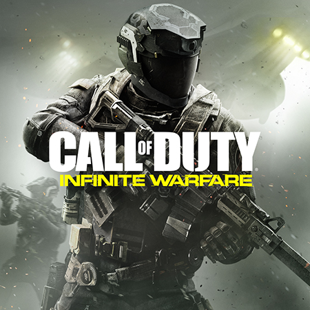
In this it is clear to see that this game is going to be about danger and shootings this is clear from the colours that are being used such as black which indicates danger and death also from the image that has been used of someone that is holding a gun which is used to shoot people and protect them selves linking back to the fact that the game is going to be about shooting and defending your self. The structure is very well laid out and very organized this is clearly showing that this game isn't for young children which you can also see by the image of the gun. The use of the man that has been used shows that this game is targeted for young men. All of the attention on the front cover is on the man with the gun this is to show importance and what the audience should really be focusing their attention to.
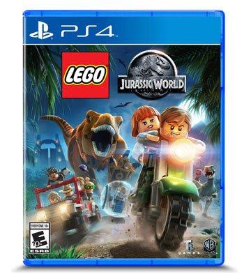 The colours used are bright bold colours such as white green yellow this is targeted to the target audience which are young children this is also shown through the images that have been used such as the use of the Lego characters and the use of the mythical creatures which are used to appeal to young children. also the structure isn't very well out and organized this is another reason why this could be seen to be targeted to young children because when something is well organized it is seen to be Add to dictionary which older people should be.
mythical creatures
Thursday, 23 March 2017
Wednesday, 22 March 2017
task 2b
mood and atmosphere
colour; mood and atmosphere can be shown through the use of colours for example if the colour that was used was black them that would connote sadness or something dramatic. this can all be shown through the use of colours and how colours are combined together to create meaning for the audience.
for my campaign poster about no drugs is could be seen as cutting edge as this poster is very unique and uses bold images and colours rather than using simple plain colours also the images are the things that stand out the most in the poster.another reason as to why this poster is cutting edge is because of the structure of the poster and how every picture is combined together and is organized. The genre for the poster is horror because of the images used such as skulls this is to warn the audience that drugs are dangerous and could kill. The atmosphere for this poster is almost childlike and is not seemed to be formal. The drug campaign could be seen t be youthful because of all the colours and types of images used which seem to be aimed for young people this is because the drug poster is mostly aimed at young people making them aware that drugs can be harmful and could kill and letting them know and aware before it is to late.
how this is used throughout the use of
composition is used in the poster because it is a creative piece of work they have used cartoon images in the poster. The point of focus is the big circle with a line through the images as it is used to show that if you stop using drugs then death and danger will not occur. The colours in my poster are bright to stand out and uses the colour red to connote blood which then connotes the idea of death or harm to the body. scaling most of the important and pieces of the poster is in the middle to stand out and show importance to the audience. Basic semiotics are used such as danger love and death this then leads to the audience to think about there loved ones and how they could be causing harm to them selves which may then lead them to stop and try and stop. Typography is used by ''no drugs'' in a bold and big text.heirechy could be towards young people as they are more likely to be exposed to drugs because for the types of things young people face in their everyday day to day life.
website campaign
mood and atmosphere that has been used is traditional because the amount of people that have wanted to become president have used a website to promote themselves also a website can bring in more people to learn and find out new things about Barack Obama. The website could be seen as being dynamic because for the fact that Barack Obama was the first black president this mad many people which was mostly black amazed and joyful about having the first black president in America. in this website it doesn't really have a genre because it isn't seemed to be comedy or horror or any other type of genre this could indicate that Barack Obama is his own person and doesn't need to be defined by a genre making him more unique. Ideology is used such as poloticional values and religion, this indicates that Barack Obama takes into consideration of different values and religions because of the amount of religious attacks that haven't happened in America and because Barack Obama wanted to make a change.
the point of focus in this website is the image of Barack Obama this lets the audience know how important he could be because of the size of the image and because of the fact that he has been place in the middle of three front page of the website. The colours used in this website are simple and light such as blue this connotes purity and safety there fore highlighting the fact that Barack Obama is very pure and he is trying to make America safer. Also representing the American flag because blue is the main colour in Ignore the website is clear and focused and is very well structured and well organized. Basic semiotics are used such as purity and love this shows that Barack Obamas love is pure that he is willing to do the most for America because of the love he ahs for the people this makes the people head towards him because of the idea of there president loving them then they will think that he will listen to them. A lot of transitions are used in the poster such as the texts and the transitions made to go from one page to another. no audio is used in the website this could show the audience that all the attention should be towards researching and finding out more about Barrack Obama.
advert campaign
mood and atmosphere has been used in this advert dynamic and youthful because of the creation of a child facing the same problems of a child that lives in a country that is facing war or attacks, this is not seemed to be real life for country's that have no or attacks going on so this advert is trying to send a message or make the people have an idea of what is going on in country facing these problems this can the lead the audience to feel sympathy towards people that are facing these problems in a country they should be able to call their ''home' 'the genre that this advert has used is horror because it is using things such as explosions which could be seen to be horrifying. The ideology that is used I this advert is values this is because the audience should be able to value the things that they have now cherish everything they have before it is too late this will them lead some of the audience to then cherish and value the things in life. They have used diegetic sounds and real life sounds to make the audience feel like they are in the girls position or even imagine them selves being in her position and also it makes I more life like the viewers.
the point of focus in this advert is the little girl the camera follows her around throughout the whole of the advert this is to show importance and so the viewers know that they should be focusing on her throughout the advert. The colours that are used in the beginning are bright such as yellow to show happiness ad peace then towards the end the colours turn dark such as black for the smoke of the girls face this connotes danger and death therefore making the viewers realise how quickly things can change and how dangerous it is in country's that have wars or attacks therefore leading them to wanting to help out.basic semiotics are used such a emotions values feelings the emotions on the girls face and the feelings that the little girl is feeling and this is shown through her facial expressions and her surroundings. The typography used is ''just because it isn't happening here doesn't mean it isn't happening' 'this is used for people who haven't understood the advert and also as a brief summary of what the advert is basically trying to say. this makes the audience/viewers more aware of what is going on. Many transitions are made through out this advert such as a shot change every second this connotes how fast things could change or have changed. They have used diegetic sounds and real life sounds to make the audience feel like they are in the girls position or even imagine them selves being in her position and also it makes I more life like the viewers.
Thursday, 16 March 2017
website evaluation
website evaluation
colour; the colours i have used for my blogger are very bright and bold colours such as green, yellow, bright blue this was because of the images i used such as palm trees, pineapples which also fit into the reggae genre.another reason for using all these bright and different colours is that so when people go onto my website they can get an idea of what colours are used for the reggae genre. Also as soon as people come on my website it doesn't just look plain and simple that way they have something fun to look at whilst also getting ideas for their own reggae poster and also they can see how fun and enjoyable making a reggae poster and be so then they will then want to make their own reggae poster which is what my website is all about for people who are interested in reggae posters.point of focus; my point of focus for my website was my first my second page where it had all the posters my class had made this is so poeple that are wanting to get involved can see the different types of ways they can design their poster and also take ideas from other people so it is going to be easier for them to then design their poster also it is for people who don't really know much about the reggae genre and so they can see what kind of things go into a reggae poster also i put a link that takes them to where all the reggae posters are if they wanted to see more posters.scale; at the very first page there is a big youtube video of reggae music and it is placed right in the middle of them page this is so i catches the audience attention and to show that it could be important to listen to them music whilst looking through the website.at the top of my website on each 3 pages there is a big banner saying ''reggae'' which is black and green this has been kept simple so the background is more of the attraction.in my website it is easy for people who go onto my website to go on the 4 different pages that I have just by clicking on one of the signs it will lead them into my other page in less than a second also when people first visit my website the 4 signs flash up so then people can see that the are there be accessed also I have signs reading ''learn more about reggae or see more reggae posters'' these will then lead them onto different pages outside of my website.my website is very well layer out on my front page of my website I have a YouTube video place right in the middle of my page taking up nearly the whole page so people can then enjoy listening to reggae whilst looking through the rest of my website in my second page it is simple because all the picture are on one side which are small then when clicked out can be opened up this makes the pages look more organized and on the other side there is a click button which will lead people to more posters outside of my website if they are interested instead a/of combining every single reggae poster onto one page which will make my website look less organized and rushed my third page has information about reggae which when clicked n can open up and finally my last page has a clear and simple fill out page if you are interested in joining the reggae completion. hierarchy I used designs from the website for my background but my banner I had made my self on photoshop the posters on my page where made by me and my class mates and also the information page my blog was all my information about reggae.
colour; the colours i have used for my blogger are very bright and bold colours such as green, yellow, bright blue this was because of the images i used such as palm trees, pineapples which also fit into the reggae genre.another reason for using all these bright and different colours is that so when people go onto my website they can get an idea of what colours are used for the reggae genre. Also as soon as people come on my website it doesn't just look plain and simple that way they have something fun to look at whilst also getting ideas for their own reggae poster and also they can see how fun and enjoyable making a reggae poster and be so then they will then want to make their own reggae poster which is what my website is all about for people who are interested in reggae posters.point of focus; my point of focus for my website was my first my second page where it had all the posters my class had made this is so poeple that are wanting to get involved can see the different types of ways they can design their poster and also take ideas from other people so it is going to be easier for them to then design their poster also it is for people who don't really know much about the reggae genre and so they can see what kind of things go into a reggae poster also i put a link that takes them to where all the reggae posters are if they wanted to see more posters.scale; at the very first page there is a big youtube video of reggae music and it is placed right in the middle of them page this is so i catches the audience attention and to show that it could be important to listen to them music whilst looking through the website.at the top of my website on each 3 pages there is a big banner saying ''reggae'' which is black and green this has been kept simple so the background is more of the attraction.in my website it is easy for people who go onto my website to go on the 4 different pages that I have just by clicking on one of the signs it will lead them into my other page in less than a second also when people first visit my website the 4 signs flash up so then people can see that the are there be accessed also I have signs reading ''learn more about reggae or see more reggae posters'' these will then lead them onto different pages outside of my website.my website is very well layer out on my front page of my website I have a YouTube video place right in the middle of my page taking up nearly the whole page so people can then enjoy listening to reggae whilst looking through the rest of my website in my second page it is simple because all the picture are on one side which are small then when clicked out can be opened up this makes the pages look more organized and on the other side there is a click button which will lead people to more posters outside of my website if they are interested instead a/of combining every single reggae poster onto one page which will make my website look less organized and rushed my third page has information about reggae which when clicked n can open up and finally my last page has a clear and simple fill out page if you are interested in joining the reggae completion. hierarchy I used designs from the website for my background but my banner I had made my self on photoshop the posters on my page where made by me and my class mates and also the information page my blog was all my information about reggae.
Tuesday, 14 March 2017


Subscribe to:
Posts (Atom)